
What is the unemployment rate?
The genesis of this post is that I got interested in what the real unemployment rate is in the country. The “American Carnage” tack that the Trump administration sometimes takes to describe the state of the economy (ie- the inauguration address) seems at odds with the reports we’re hearing of ever-decreasing unemployment and srengthening economy. I got curious what could be the basis for this disconnect, and I wanted to look at the data instead of going into political or rhetorical analysis…
TL;DR: the real unemployment rate is at least twice the oft-reported unemployment rate, so things aren’t nearly as rosy as we sometimes might think from the monthly jobs coverage. There’s a good amount of regional heterogeneity in unemployment, so while the recovery is thundering along in some places, it may not be everywhere.
The monthly jobs report released by the Bureau of Labor Statistics (BLS) contains an “official” unemployment rate that is mostly the one discussed in the media. The good news is that the average unemployment across the United States is getting quite low! The bad news is the BLS reports another value which many consider the “real” unemployment rate, which accounts for discouraged, underemployed, and marginally attached workers.
The “official” number only considers workers unemployed if they are “still in the workforce”, meaning they have looked for a job in the last few weeks. The “real” rate counts workers who may have stopped looking for a job altogether (discouraged), have only looked within the last year (marginally attached), or are part-time employed and want to be full-time employed (underemployed).
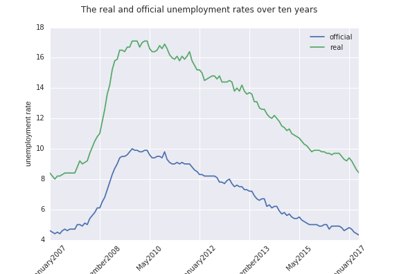
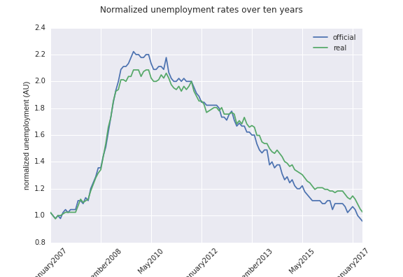
So, onto the data– the first figure shows just a straight-up comparison of the two unemployment figures. Agreeably, they are both well down since the height of the Recession and seem to roughly track each other. The second figure normalizes the two curves to start at 1.0, so they can more easily be comapred visually. You can see that at some point, the real unemployment rate dips below the “official” number. At that point, it becomes possible to believe unemployment is getting better, when in reality, people are becoming discouraged and stopping their search for jobs.
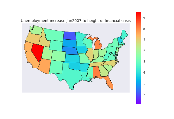
BLS also releases per state data which are the “official” unemployment numbers (so not counting the discouraged workers). I plot here a map of the lower 48 States and the color-mapped jump in their unemployment values from January2007 to the height of the Recession (taken as the max unemployment for each state). Somewhat staggeringly, bear in mind that the real unemployment during these times is likely to be twice (!!) the values here. The biggest thing that jumped out at me was how well central US states fared, which has been discussed before and is largely due to natural resource booms in those areas.
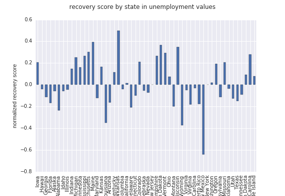
I also wanted to get a sense for how states are faring in the recovery– so I calculated the recovery in unemployment rate as a fraction of the jump during the Recession and normalized to 1. States with a negative value are doing worse since before the Crash and positive numbers are states doing better. The overall average is -0.02, but as the plot shows there’s significant heterogeneity in recovery. Some places like Wisconsin are doing great! Unemployment is lower now than before the crash. Other places are much worse off since the Recession, like New Mexico.
The technical bits: analysis and plotting code here.
the BLS API is neat but it wasn’t trivial to get the state-by-state data. I found a listing of state codes the BLS uses and was able to use that to send individual requests for the state series data through the API. The data structure was also a bit of pain so in the repo there’s the beginnings of a function for extracting that data in Pandas dataframes.
“real” (u6) unemployment seriesid: LNS13327709
“official” (u3) unemployment seriesid: LNS14000000
BLS API : https://api.bls.gov/publicAPI/v2/timeseries/data/’