
the rents are too damn high (said the FT)
Recently there was an interesting editorial piece in the Financial Times calling for the UK government to target rent affordability in addition to easing costs for home owners. How could we go about making rent more affordable? I’m sure many policy specialists, economicists, and poli-sci majors could tell us how to do this. As a biologist, when I want to figure out how something works, I often look for places and situations where this something is naturally broken relative to the normal state. So from this perspective, I decided to rank cities in the US based on the affordability of renting versus owning homes. By then looking at renting, housing, development, and other policies in cities where rent affordability is hihg, relative to cities where rent affordability is low, we can gather from the data what actually works to lower rents.
I turned to the Kaggle American Community Survey dataset to perform this analysis. The ACS dataset contains demographic information aggregated from households polled during the US census. For this cursory analysis, I simply extracted the average cost of rent and mortgages per household normalized to number of people in the household. Price/sqft of space would be a better metric for further analysis, as you can easily imagine the sqft/person that families are comfortable with changes dramatically from one end of the socioeconomic ladder to the other. I also normalized to the average household income, which helps to control for differences in living costs in different parts of the country. Importantly, this analysis doesn’t look at rents versus income, but rather, the relation of mortgage costs versus rental costs. For example, NYC ranks very well with my rent_afford metric, but that doesn’t mean it is cheap to live or rent there!
the analysis code The obvious takeaway is rent control! Of the top ten best affordability regions, four are in NYC.
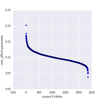
After sorting according to rent_afford, the distribution of the PUMAs is beautiful.
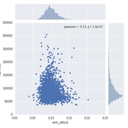
There’s a slight negative correlation between household income and rent_afford.
best rent affordability
46_200,                                          Lakota Region
36_4003,     NYC-Brooklyn Community District 3--Bedford-Stu...
36_3710,     NYC-Bronx Community District 1 & 2--Hunts Poin...
1_1700,      Dallas, Bibb, Marengo, Hale, Sumter, Perry & G...
13_3700,          Northeast Georgia Regional Commission (East)
36_3705,     NYC-Bronx Community District 3 & 6--Belmont, C...
1_1400,      Walker, Marion (South & West), Fayette & Lamar...
36_3003,     Rockland County (West)--Spring Valley, Suffern...
47_3100,                 Tipton, Fayette & Lauderdale Counties
36_3104,                        Westchester County (Southeast)
worst rent affordability
4_122,                           Phoenix City--Maryvale (East)
42_3210,                         Philadelphia City (Southwest)
12_3301,                               Escambia County (North)
48_4503,     Houston-Galveston Area Council--Montgomery Cou...
55_70201,                               Waukesha County (East)
1_2600,                                         Baldwin County
47_1500,                           Sevier & Jefferson Counties
32_409,      Clark County (Central)--Paradise (Northwest) &...
37_4800,                                      Brunswick County
45_1102,     Horry County (Southeast)--Myrtle Beach, North ...
Name: PUMA NAME, dtype: object